Do you want to use mobile popups on your website?
Mobile popups can be very effective for lead generation, increasing sales, and getting more app downloads, but you need to design them the right way. Otherwise, you could end up harming your website’s search engine rankings.
In this guide, we will share how to create mobile popups that have high conversion without hurting your SEO rankings.

How Could Mobile Popups Hurt Your SEO?
Mobile popups could harm your WordPress SEO efforts if they go against Google’s guidelines. Google states that sites may be ranked lower in mobile search for using intrusive interstitials or intrusive popups.
If your page has a popup that appears immediately, then Google can penalize that page. This means your page will not rank as high in Google’s search results as it otherwise would have.
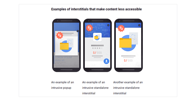
Google doesn’t want your popup to cover all or most of the page before the user gets to see the content. These are some examples from Google of what they want you to avoid.

So you might be wondering, then why risk creating popups on mobile?
The short answer is that it helps you increase conversion rates, which results in more leads and sales. This is why many smart business owners and marketers continue to use popups on both mobile and desktop.
The important part is that you must create your mobile popups the RIGHT way so it doesn’t impact your SEO rankings.
How to Create Mobile Friendly Popups That Won’t Hurt Your SEO Rankings
There are several ways to create mobile popups that won’t hurt your SEO rankings. You could:
- Create a full-screen popup that only appears after a delay.
- Create a banner or slide-in that only covers a smaller part of the screen.
- Only use immediate full-screen popups for legal notices. Examples of these include cookie permissions and age verification popups. These aren’t penalized by Google.
In our example, we’ll cover how to create a full-screen popup that only appears after the user has been on your site for a certain length of time. However, we’ll also share best practices and tactics that you can use to add smart display rules for further optimization.
Creating a Mobile-Only Popup With OptinMonster
OptinMonster is the easiest way to create a mobile-only popup. It’s the most popular lead generation tool on the market and has a powerful WordPress popup builder.
First, you need to visit the OptinMonster website and register for an account. Simply click the ‘Get OptinMonster Now’ button to continue.
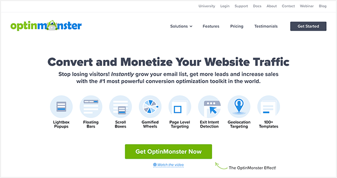

While all their templates are mobile responsive, you need the Pro account to unlock mobile-specific display targeting rules.
After registering, you need to install and activate the OptinMonster plugin on your WordPress site. For more details, see our step-by-step guide on how to install a WordPress plugin.
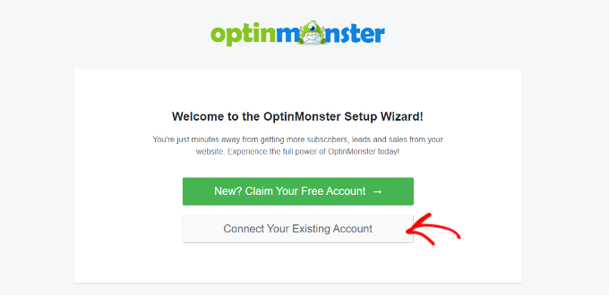
Upon installation, you should see the welcome screen and the setup wizard. Go ahead and click the ‘Connect Your Existing Account’ button and follow the on-screen instructions.

Next, a new window will now open asking you to connect your WordPress website to OptinMonster.
You can click the ‘Connect to WordPress’ button to continue.


Once your OptinMonster account is connected, you are ready to create a mobile popup.
You can head to OptinMonster » Campaigns in your WordPress admin and click the ‘Create Your First Campaign’ button.
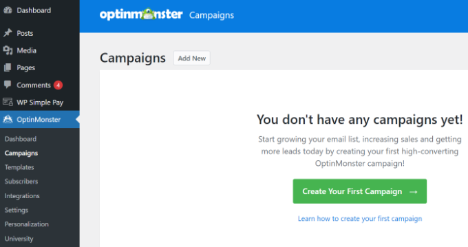

You will be taken to the OptinMonster campaign builder, where you can choose a campaign type and template.
Simply leave the Campaign Type set to ‘Popup.’


Next, OptinMonster will show you multiple templates for your popup campaign.
First, click the ‘Device/Mobile’ tab and select the ‘Mobile Specific (Optimized)’ device filter. From here, you can select any template for your campaign.
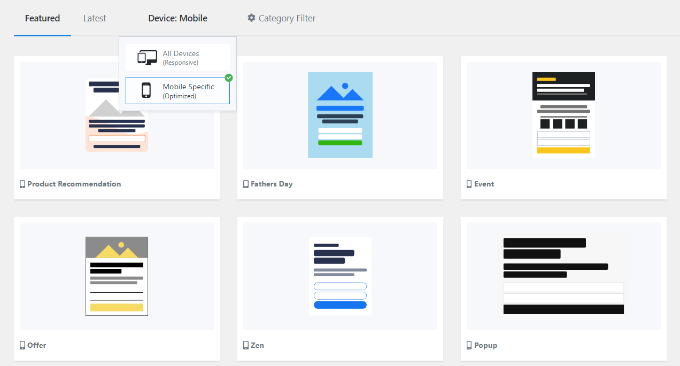

When you choose a template, a window will open.
Simply enter a name for your campaign and click the ‘Start Building’ button.


The template will automatically load the popup’s optin view in the OptinMonster builder. Customizing the content or adding new items with the drag & drop interface is easy.
You can drag any block from the menu on your left and drop it on the template. For example, you can add an image, button, countdown timer, and more.
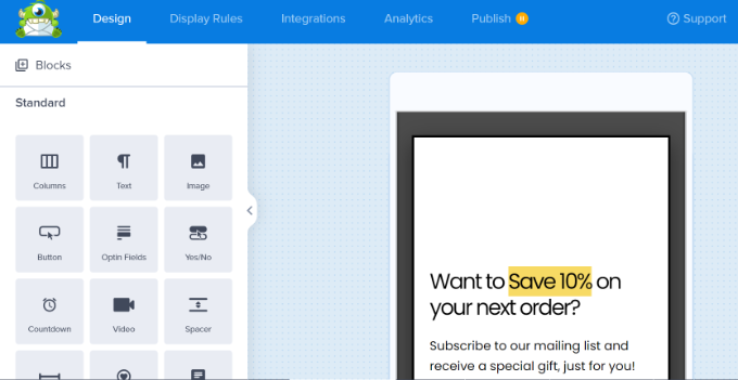

Besides that, the plug lets you customize existing elements on the template.
For instance, to change the default text, you just need to click on it and type the text you want to use.
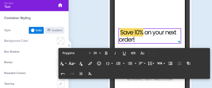

You also need to edit the ‘Success’ view. This will be what users see after they enter their email addresses.
To edit the Success view, simply click on the Success tab at the bottom of the screen.


Once you’re happy with both the optin view and the success view, don’t forget to click the ‘Save’ button at the top of the screen.
Setting the Display Rules for Your Mobile Popup
Now, it’s time to set the display rules for your popup. First, you need to click the ‘Display Rules’ tab at the top of your screen.
The default rule is for your popup to show after users have been on your site for 5 seconds. You can increase this time period if you want.
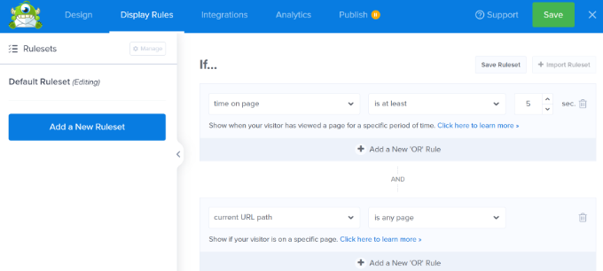

You can also add other mobile-safe targeting rules to unlock further optimizations such as:
- Exit Intent for Mobile – this will only show the popup if the user hits the back button or is about to close the tab.
- Inactivity Sensor – this will only show the popup after the user has stopped being active on the site for a certain number of seconds.
- Scroll Trigger Popups – this will only show the popup after the user scrolls down a certain percentage of the page.
- Button Click by MonsterLinks – this will only show the popup if the user clicks on a specific button.
Your popup uses a Mobile Optimized template. This means it will automatically only display on mobile devices.
Next, you can select the pages on which the popup will appear.
By default, the rule will be set to ‘current URL path is any page.’ This means that your popup will appear on all posts and pages of your site.
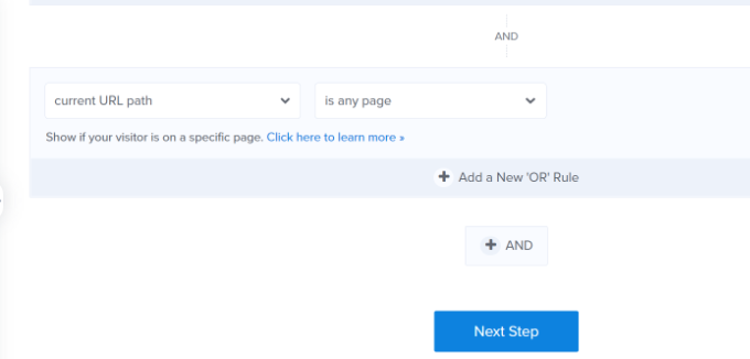

You can then click the ‘Next Step’ button.
OptinMonster will then allow you to add an animation and sound effect when your mobile popup appears.
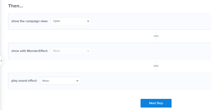

After that, you can click the ‘Next Step’ button.
You will now see a summary of your display rules. At this stage, you can edit your settings and make changes to your campaign.
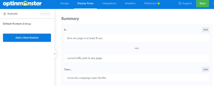

Next, you can go to the ‘Integrations’ tab and add an email marketing service such as Constant Contact. OptinMonster integrates with most major platforms, so you will just need to select the one you use.
If you don’t have one, WPBeginner readers can get 20% off their first 3 months with Constant Contact.
Simply click the ‘+ Add New Integration’ button from the panel on your left and choose your email marketing tool.
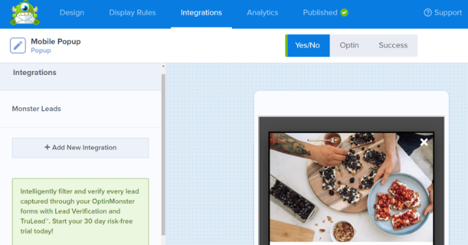

Next, you can go to the ‘Published’ tab at the top.
After that, make sure the ‘Publish Status’ is changed from ‘Draft’ to ‘Publish.’
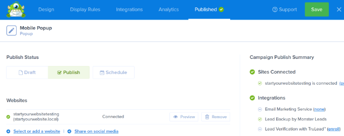

Don’t forget to click the ‘Save’ button at the top of the screen and close the campaign builder.
Putting Your OptinMonster Campaign Live on Your Website
Your OptinMonster campaign won’t automatically go live on your WordPress website. Instead, you need to log in to your WordPress admin and go to OptinMonster » Campaigns.
You should now see your new mobile popup campaign listed here. Then, click the ‘Change Status’ link below your campaign’s name and select the ‘Publish’ option under the Status column.
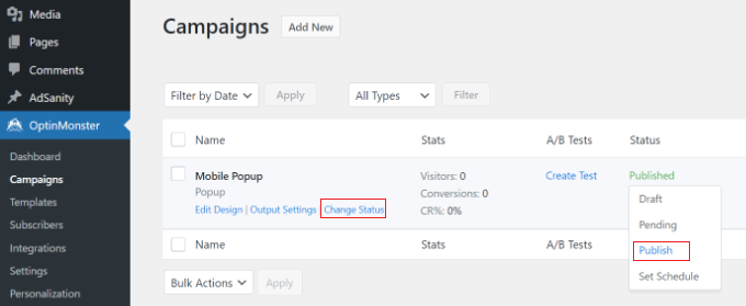

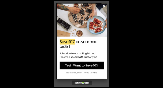
Now, your campaign will be live on your WordPress website. Go ahead and view it by going to your site on a mobile device.
Simply wait for the length of time you specified in the display rules, and your popup should appear. Here’s our popup live on our demo site.

Other Types of Mobile Popups That Won’t Harm Your Mobile SEO Rankings
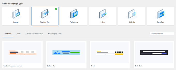
Aside from time-delayed and user interaction popups in OptinMonster, you could create a floating bar, slide-in, or inline option. Google won’t consider these intrusive, so you don’t have to worry about your SEO taking a hit.
- A floating bar optin can appear at the top or bottom of the user’s screen, without covering up the content.
- A popup can slide in from the bottom or side of the website, usually after a time delay.
- An inline optin can sit within the content itself, part way through a page or post.
Simply select one of these types when you begin building your campaign. You will then see the templates you can use.

We hope this article helped you learn how to create mobile popups that won’t hurt your SEO. You might also like our article on the best WordPress plugins for business websites, and how to choose the best WordPress hosting.
If you liked this article, then please subscribe to our YouTube Channel for WordPress video tutorials. You can also find us on Twitter and Facebook.
