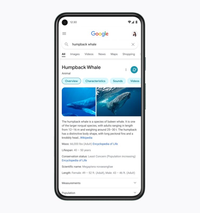
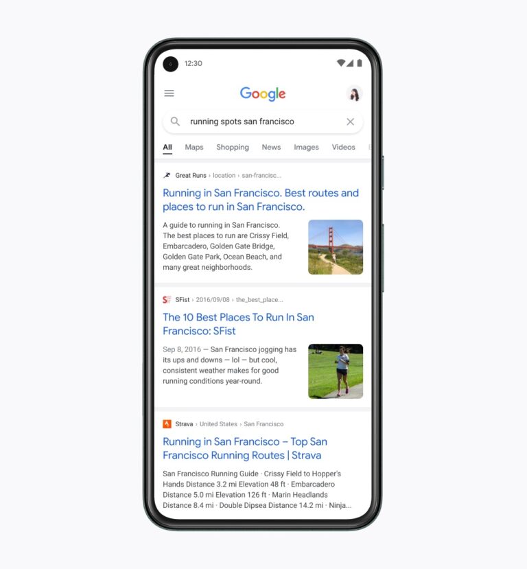
Google is updating the design of mobile search results with a modern experience that makes it easier for people to find what they’re looking for.
With the redesigned version of mobile search Google aims to improve the experience for users in three key ways:
- Easier reading: Sections and labels are larger and clearer to help users find what they’re looking for faster.
- Simpler design: Improvements made to sections and results card designs to create more white-space, helping users focus on content that matters.
- Modern approach: A fresh new look for Search that Google describes as “simple, friendly, and approachable.”
Let’s look at several of the major elements of the redesign, an effort which was lead by Google designer Aileen Cheng.
5 Major Elements of Google Mobile Search Redesign
Simplicity
Cheng says:
“We want to let the search results shine, allowing people to focus on the information instead of the design elements around it.
It’s about simplifying the experience and getting people to the information they’re looking for as clearly and quickly as possible.”
Reading

Larger, bolder text is used throughout the design to make results more scannable.
Advertisement
Continue Reading Below
Edge-to-Edge Design

Cheng says:
“We decided to create a new edge-to-edge results design and to minimize the use of shadows, making it easier to immediately see what you’re looking for.
The overall effect is that you have more visual space and breathing room for Search results and other content to take center stage.”
Advertisement
Continue Reading Below
Color
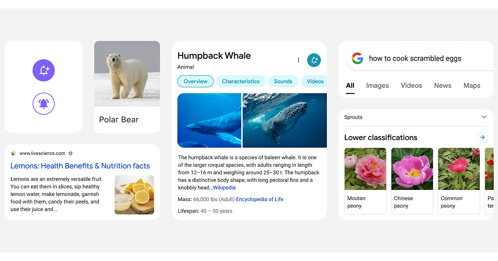
The new design boasts a more intentional use of color to guide the eye to important information.
“Googley” feeling

Above all, Google wants to maintain the feeling of using a Google service that’s “bubblier and bouncier.”
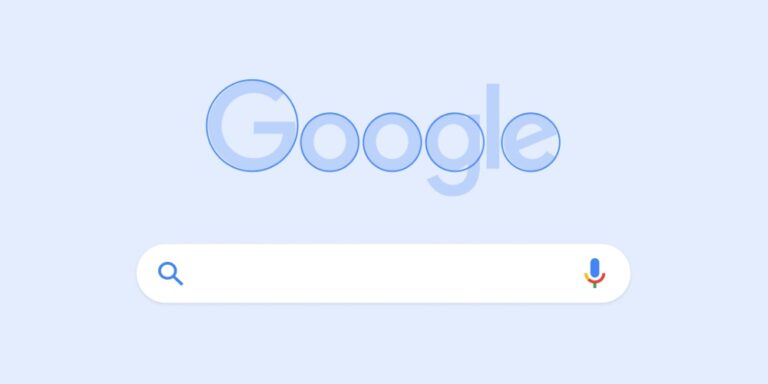
The design borrows from the roundedness of the Google logo and makes icons and other imagery more round.
Advertisement
Continue Reading Below
Look for the circles in the logo, Search bar, and font. Google believes this feels more approachable, friendly, and human.
More of this is now in the font, rounded edges of the knowledge panels, and on one side of an image or video carousel.
Rolling Out Soon
Google says the new design for mobile search results is rolling out “in the coming days.”
The update only affects the look and feel of search results. There’s no difference to how content is indexed or ranked, how much information is included in search snippets, or anything like that.
Source: Google


