In 2021, Google will be updating its algorithm to incorporate page experience as a ranking signal.
The aim of this change is to factor in the user experience of pages being returned in the SERPs, rather than the traditional and more objective signals such as PageRank and on-page targeting that have been used historically.
With this upcoming update approaching, it is critical to understand the different facets of page experience and how to optimize your site for each one of them.
Luckily, Google has announced the different elements that will feed into determining the overall experience of a page. These are:
- Core Web Vitals: A combination of three key performance metrics – Largest Contentful Paint, First Input Delay and Cumulative Layout Shift – that measure the visual loading, interactivity, and visual stability of a page as it loads for users.
- Mobile-Friendliness: Looks at how easy websites are to use and navigate on mobile devices, including the readability of content and whether links and on-page elements are clickable and accessible.
- Safe Browsing: Assesses whether a site has issues such as malware, phishing and hacked content, to ensure that users can browse safely.
- HTTPS: Focuses on whether the connection of a website is secure and if the site is being served over HTTPS as recommended, or not.
- Non-Intrusive Interstitials: Ensures that crucial on-page content is not obstructed for users as they are browsing.
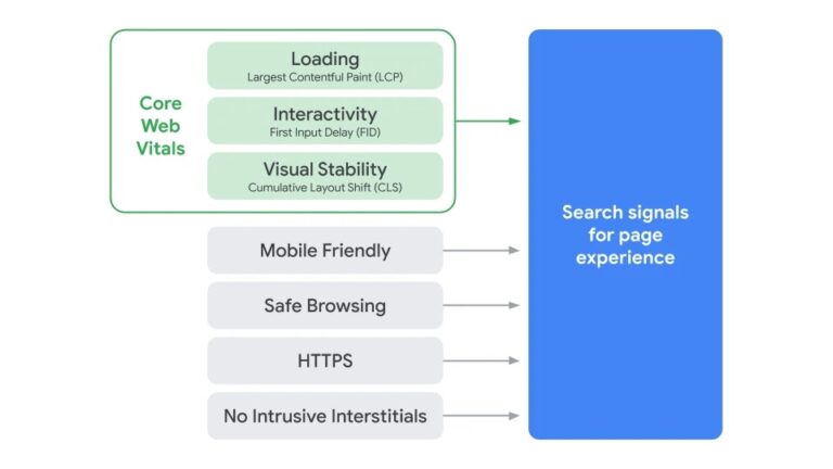
To help you make sure your site is ready for this change, I’ve put together some tips for optimizing your site for the key areas of page experience.
These cover areas such as faster and smoother visual loading, improved mobile usability, and enhanced website security.
1. Preload Key Resources to Speed up Visual Load Times
One of the first indicators for a user that a page is loading is the appearance of above-the-fold content.
This is where Largest Contentful Paint (LCP) and the first Core Web Vitals metric comes in to measure how quickly the main on-page element loads.
To identify what a page’s LCP element is, simply inspect the page in Chrome DevTools and it will be shown in the waterfall chart in the Performance tab.
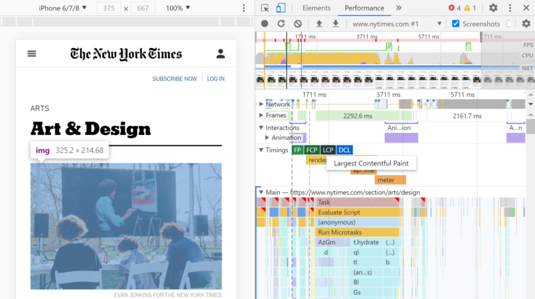
Once you know what the LCP element is, an easy way of seeing the visual progress of how quickly it loads is to use the Performance tab in Chrome DevTools.
Advertisement
Continue Reading Below
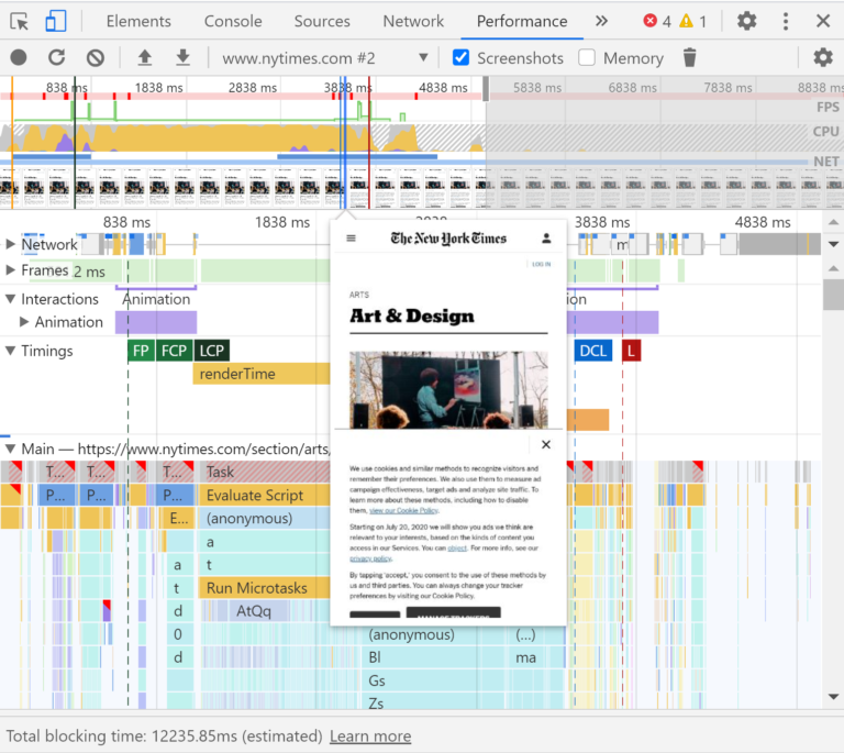
Make sure Screenshots is selected and start profiling the page while it loads.
Once your profile is complete, hovering over the load chart at the top will show you a screenshot of the page as it loaded over time.
This will help you to visualize how quickly the different page elements load.
To help speed up the loading of the LCP element and above-the-fold content, consider using methods like preloading to tell the browser to fetch these resources first as a priority.
 Example from MDN Web Docs
2. Optimize Main Thread Activity by Minimizing Long Tasks
There are many different issues behind the scenes that can cause a user to have to wait for the browser to respond to them tapping or clicking on a page.
Advertisement
Continue Reading Below
This is what is measured by the second Core Web Vitals metric, First Input Delay (FID).
While this experience can be frustrating for users, there are things we can do to resolve this issue and reduce waiting times between human interactions and browser responses.
Long tasks are a common contributor to this issue.
Essentially, these are pieces of JavaScript code that block the main thread for a long period of time and causes the page to freeze and become unresponsive.
Long tasks in Chrome DevTools can be found at the top of the waterfall chart under the Main tab, and are highlighted with a red triangle.
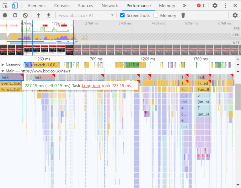
If you click on a long task and go into the Bottom-Up tab, this breaks down the different activities that occurred within the task, such as compiling and parsing scripts.
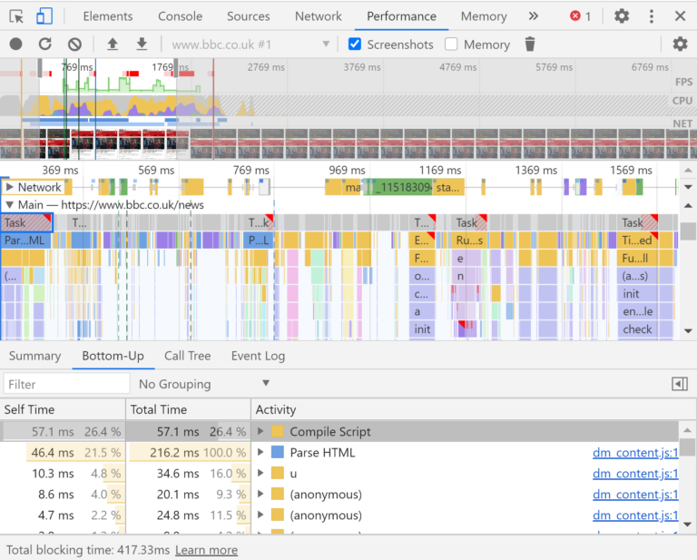
The fix required will vary depending on the activities that are contributing to main thread blockages, but a common fix for resolving long tasks is code splitting and serving scripts in smaller chunks.
Advertisement
Continue Reading Below
3. Reserve Space for Images & Embeds to Load Into
The third Core Web Vitals metric, Cumulative Layout Shift (CLS), looks at the amount that the visual layout of a page moves around as a page loads.
This is to measure a frustrating area of UX that we have all probably experienced:
A user goes to click a particular link but the page shifts around and they end up accidentally clicking into a different area of the page.
One of the most common causes of a high CLS score, and therefore poor UX, is not reserving spaces for images and embedded resources to load into.
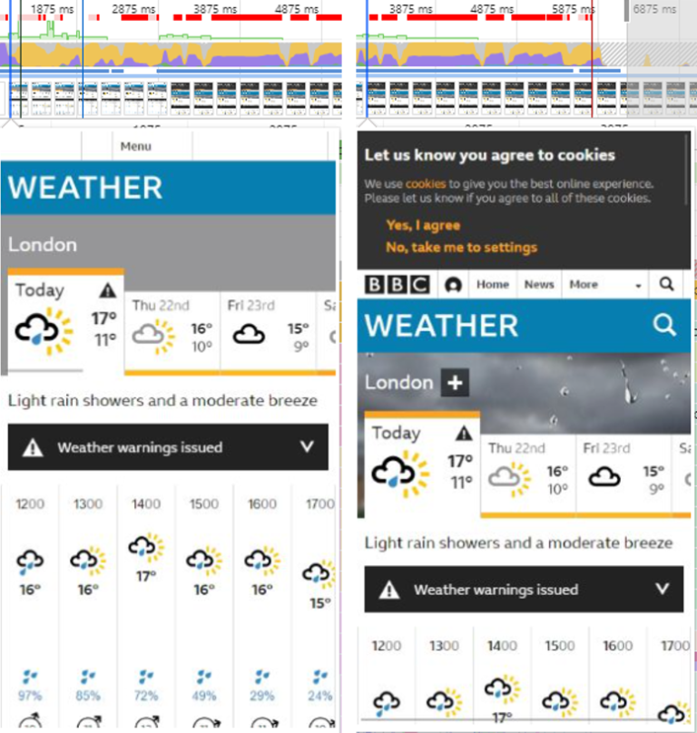
For example, by using the Chrome DevTools screenshots feature in the Performance tab, we can see that the BBC Weather cookie consent banner does not have an allocated space to load into.
So once it loads it pushes the visible content lower down in the viewport at around the 3-second mark.
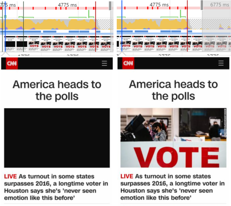
However, in this example from CNN we can see that the featured video on their homepage has a reserved space in the page’s structure, so the rest of the page layout remains unchanged once the video has been loaded in.
4. Make Sure Key Page Templates Are Mobile-Friendly
After mobile traffic overtook desktop traffic in 2016, it became crucial to ensure that websites were optimized for the mobile devices that an increasing number of users were browsing with.
Advertisement
Continue Reading Below
The layout and usability of a website on a mobile device can make or break the user’s experience.
For example, users should be able to see important content in a clear and accessible way, without having to zoom in.
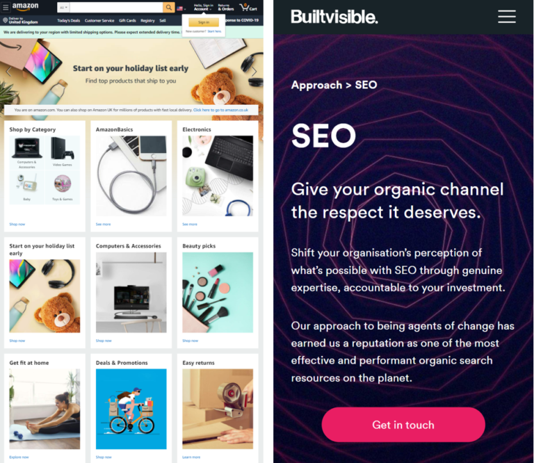 An example of a poor mobile layout on the left, next to a good example on the right.
There are two main ways to assess the usability of your website on mobile devices. The first is to monitor the Mobile Usability report in Google Search Console.
Advertisement
Continue Reading Below
This report will flag issues such as content not fitting the screen and text being too small, as well as showing you a list of affected URLs for each issue.
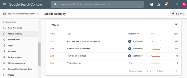
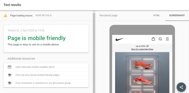
The second method is to run key page templates through Google’s Mobile-Friendly Test.
This is a good way of spot-checking individual pages.
5. Audit Your Site for Security Issues
Alongside load performance and mobile usability, website security will also play a part in the determination of page experience.
Advertisement
Continue Reading Below
Google is keen to make sure that the websites presented in the SERPs are safe for users to browse, without the risk of security issues.
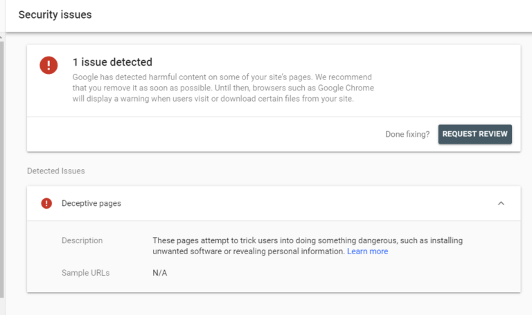
The main security issues to be aware of are malware, unwanted software, phishing, and deceptive content.
An easy way to check whether or not your website has issues that could put your users at risk, take a look at the Security issues report in Google Search Console.
This report can be found under the Security & Manual Actions heading.
6. Make Sure Forms & Embedded Resources Are Served Over HTTPS
Incorporating HTTPS as a page experience signal is another way in which Google is trying to ensure the safety of users as they are browsing.
Advertisement
Continue Reading Below
Serving content that requires user interaction and input over a non-secure HTTP connection poses a risk to users and makes them and their data more vulnerable.
This is particularly important to remember for forms where users are inputting any personal information, such as checkouts where payment information is being shared.
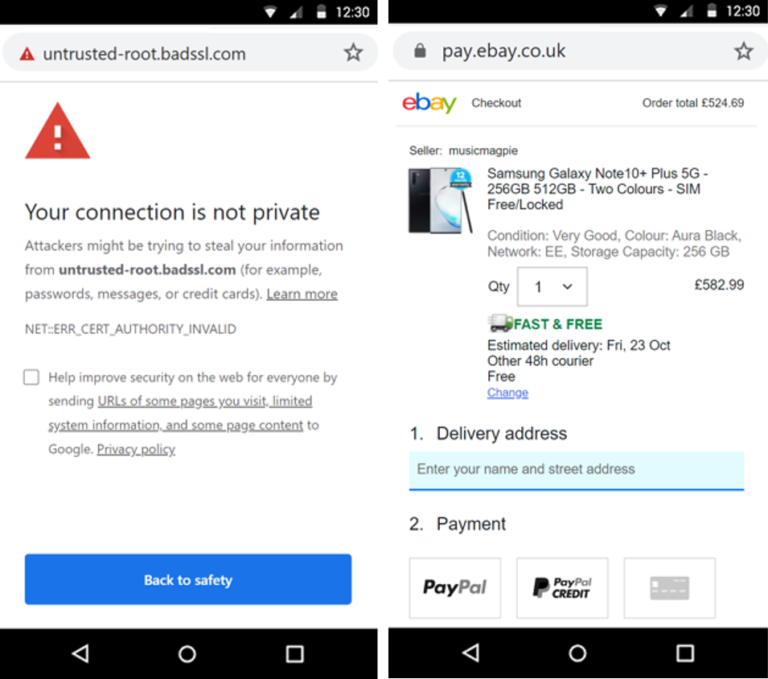 An example of an unsecure connection on the left, next to a checkout page with a secure connection on the right
One way to check for these issues is to use the Security report in Screaming Frog.
Advertisement
Continue Reading Below
Within this report, you can see the number of instances of forms being served on HTTPS URLs, as well as mixed content issues where a mixture of page resources are being served over HTTP and HTTPS.
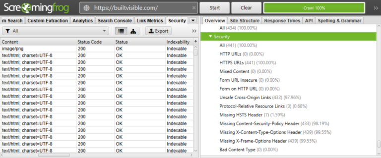
To allow your users can browse safely, make sure your site has an up-to-date SSL certificate, and migrate any of your URLs and on-page resources to HTTPS.
7. Ensure Interstitials Don’t Obstruct Crucial Content
If a website has intrusive interstitials that take up a lot of space on a page and make it difficult for users to get to important on-page content, then this can create negative and frustrating experiences for users.
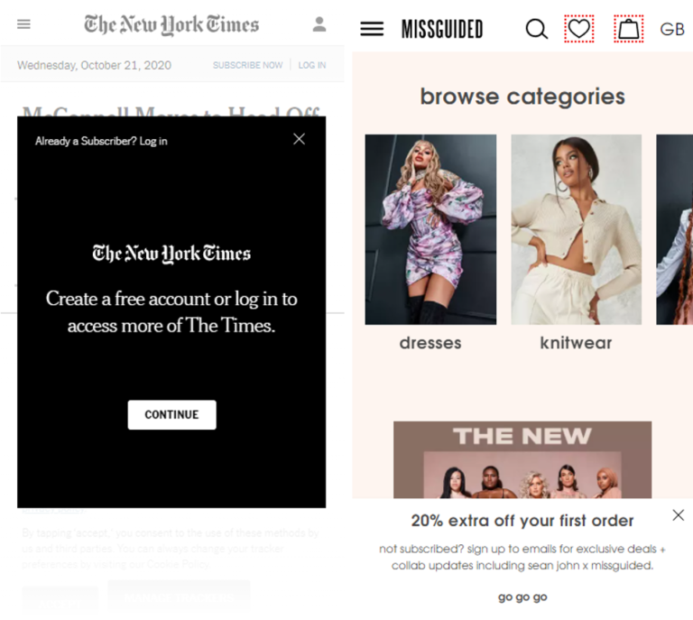 An example of an intrusive interstitial on the left, next to a non-intrusive pop-up on the right
By manually reviewing your pages on different devices or again, using the Chrome DevTools screenshots feature, you can visualize how interstitials could be impacting your users.
Advertisement
Continue Reading Below
To avoid disrupting your users’ browsing experiences.
Consider redesigning pop-ups and interstitials so that they don’t obstruct important on-page content, and also so that users don’t have to physically close them to be able to continue their journey on your site.
Conclusion
By following these tips and incorporating page experience optimization into your SEO strategy, you can help to improve your site’s page experience signals.
This will have positive effects in both the short term and long term.
Not only will enhancing page experience help to future-proof your website’s performance by putting it in the best position possible to capitalize on the upcoming algorithm update, but it will also ensure positive experiences for users on your website now.
Page experience optimization isn’t about meeting certain criteria for search engines.
It’s about providing the best possible experiences for real users.
And that’s an end goal that we can all buy into.
More Resources:
Advertisement
Continue Reading Below
Image Credits
All screenshots taken by author, November 2020


