The announcement of new iPad software at this year’s WWDC conference had an abnormally large expectation hung on it. The iPad lineup, especially the larger iPad Pro, has kept up an impressively frantic pace of hardware innovation over the past few years. In that same time frame, the software of the iPad, especially its ability to allow users to use multiple apps at once and in its onramps for professional software makers, has come under scrutiny for an apparently slower pace.
This year’s announcements about iOS 15 and iPadOS 15 seemed designed to counter that narrative with the introduction of a broad number of quality of life improvements to multitasking as well as a suite of system-wide features that nearly all come complete with their own developer-facing APIs to build on. I had the chance to speak to Bob Borchers, Apple’s VP of Worldwide Product Marketing, and Sebastien (Seb) Marineau-Mes, VP, Intelligent System Experience at Apple about the release of iPadOS 15 to discuss a variety of these improvements.
Marineau-Mes works on the team of Apple software SVP Craig Federighi and was pivotal in the development of this new version.
iPad has a bunch of new core features including SharePlay, Live Text, Focuses, Universal Control, on-device Siri processing and a new edition of Swift Playgrounds designed to be a prototyping tool. Among the most hotly anticipated for iPad Pro users, however, are improvements to Apple’s multitasking system.
If you’ve been following along, you’ll know that the gesture-focused multitasking interface of iPadOS has had its share of critics, including me. Though it can be useful in the right circumstances, the un-discoverable gesture system and confusing hierarchy of the different kinds of combinations of apps made it a sort of floppy affair to utilize correctly for an apt user much less a beginner.
Since the iPad stands alone as pretty much the only successful tablet device on the market, Apple has a unique position in the industry to determine what kinds of paradigms are established as standard. It’s a very unique opportunity to say, hey, this is what working on a device like this feels like; looks like; should be.
So I ask Borchers and Marineau-Mes to talk a little bit about multitasking. Specifically Apple’s philosophy in the design of multitasking on iPadOS 15 and the update from the old version, which required a lot of acrobatics of the finger and a strong sense of spatial awareness of objects hovering out off the edges of the screen.
“I think you’ve got it,” Borchers says when I mention the spatial gymnastics, “but the way that we think about this is that the step forward and multitasking makes it easier discover, easier to use even more powerful. And, while pros I think were the ones who were using multitasking in the past, we really want to take it more broadly because we think there’s applicability to many, many folks. And that’s why the, the discovery and the ease of use I think were critical.”
“You had a great point there when you talked about the spatial model and one of our goals was to actually make the spatial model more explicit in the experience,” says Marineau-Mes, “where, for example, if you’ve got a split view, and you’re replacing one of the windows, we kind of open the curtain and tuck the other app to the side, you can see it — it’s not a hidden hidden mental model, it’s one that’s very explicit.
Another great example of it is when you go into the app, switcher to reconfigure your windows, you’re actually doing drag and drop as you rearrange your new split views, or you dismiss apps and so on. So it’s not a hidden model, it’s one where we really try to reinforce a spatial model with an explicit one for the user through all of the animations and all of the kinds of affordances.”
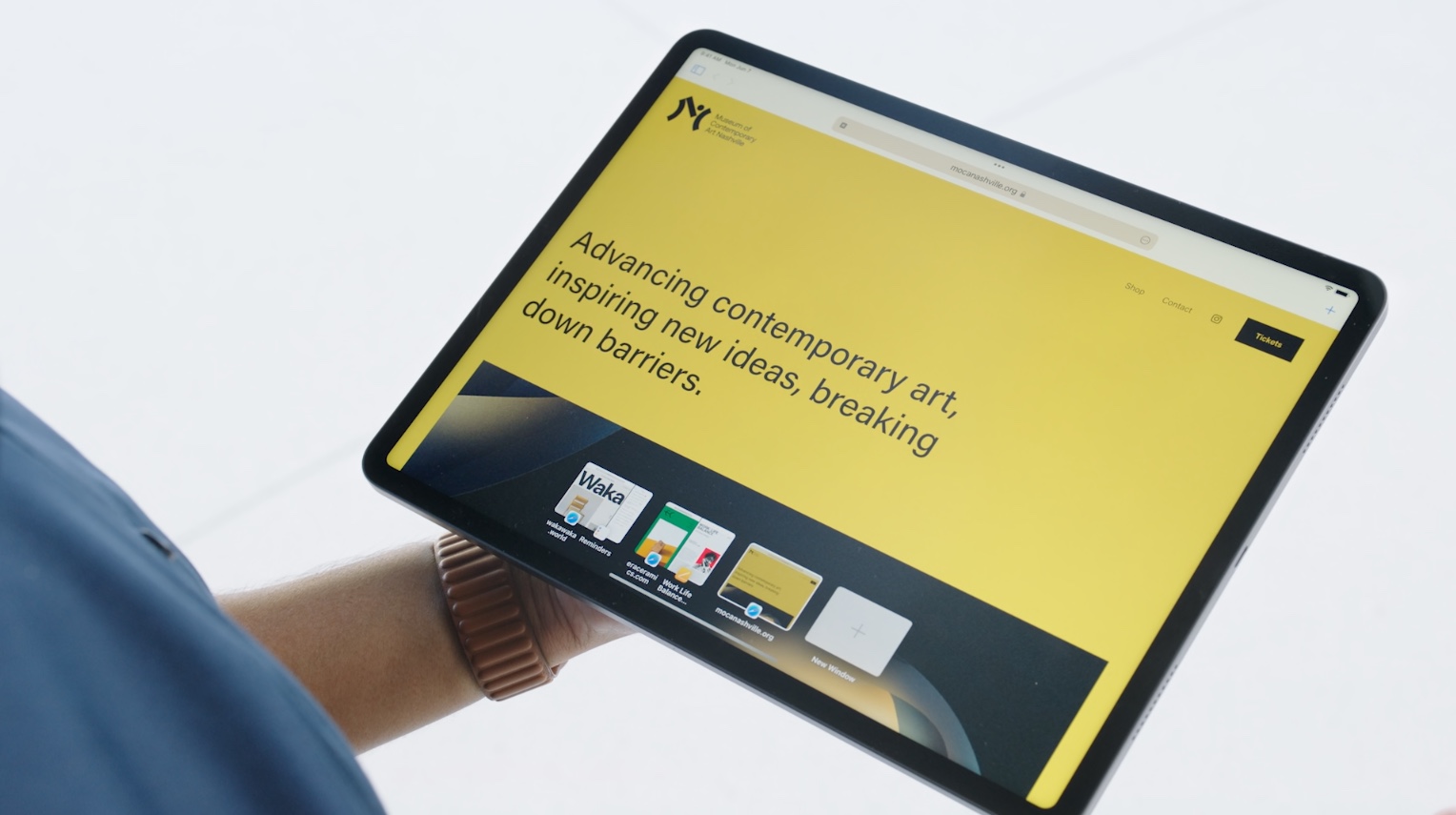
Apple’s goal this time around, he says, was to add affordances for the user to understand that multitasking was even an option — like the small series of dots at the top of every app and window that now allows you to explicitly choose an available configuration, rather than the app-and-dock-juggling method of the past. He goes on to say that consistency was a key metric for them on this version of the OS. The appearance of Slide Over apps in the same switcher view as all other apps, for instance. Or the way that you can choose configurations of apps via the button, by drag and drop in the switcher and get the same results.
In the dashboard, Marineau-Mes says, “you get an at a glance view of all of the apps that you’re running and a full model of how you’re navigating that through the iPad’s interface.”
This ‘at a glance’ map of the system should be very welcome by advanced users. Even as a very aggressive Pro user myself, Slide Over apps became more of a nuisance than anything because I couldn’t keep track of how many were open and when to use them. The ability to combine them on the switcher itself is one of those things that Apple has wanted to get into the OS for years but is just now making its way onto iPads. Persistence of organization, really, was the critical problem to tackle.
“I think we believe strongly in building a mental model where people know where things are [on iPad],” says Marineau-Mes. “And I think you’re right when it comes persistence I think it also applies to, for example, home screen. People have a very strong mental model of where things are in the home screen as well as all of the apps that they’ve configured. And so we try to maintain a well maintained that mental model, and also allow people to reorganize again in the switcher.”
He goes on to explain the new ‘shelf’ feature that displays every instance or window that an app has open within itself. They implemented this as a per-app feature rather than a system-wide feature, he says, because the association of that shelf with a particular app fit the overall mental model that they’re trying to build. The value of this shelf may jump into higher relief when more professional apps that may have a dozen documents or windows open at once and active during a project ship later this year.
Another nod to advanced users in iPadOS 15 is the rich keyboard shortcut set offered across the system. The interface can be navigated by arrow keys now, many advanced commands are there and you can even move around on an iPad using a game controller.
“One of the key goals this year was to make basically everything in the system navigable from the keyboard,” says Marineau-Mes, “so that if you don’t want to, you don’t have to take your hands off the keyboard. All of the new multitasking affordances and features, you can do through the keyboard shortcuts. You’ve got the new keyboard shortcut menu bar where you can see all the shortcuts that are available. It’s great for discoverability. You can search them and we even, you know, and this is a subtle point, but we even made a very conscious effort to rationalize the shortcuts across Mac and iPadOS. So that if you’re using universal control, for example, you’re going to go from one environment to the other seamlessly. You want to ensure that consistency as you go across.”
The gestures, however, are staying as a nod to consistency for existing users that may be used to those.
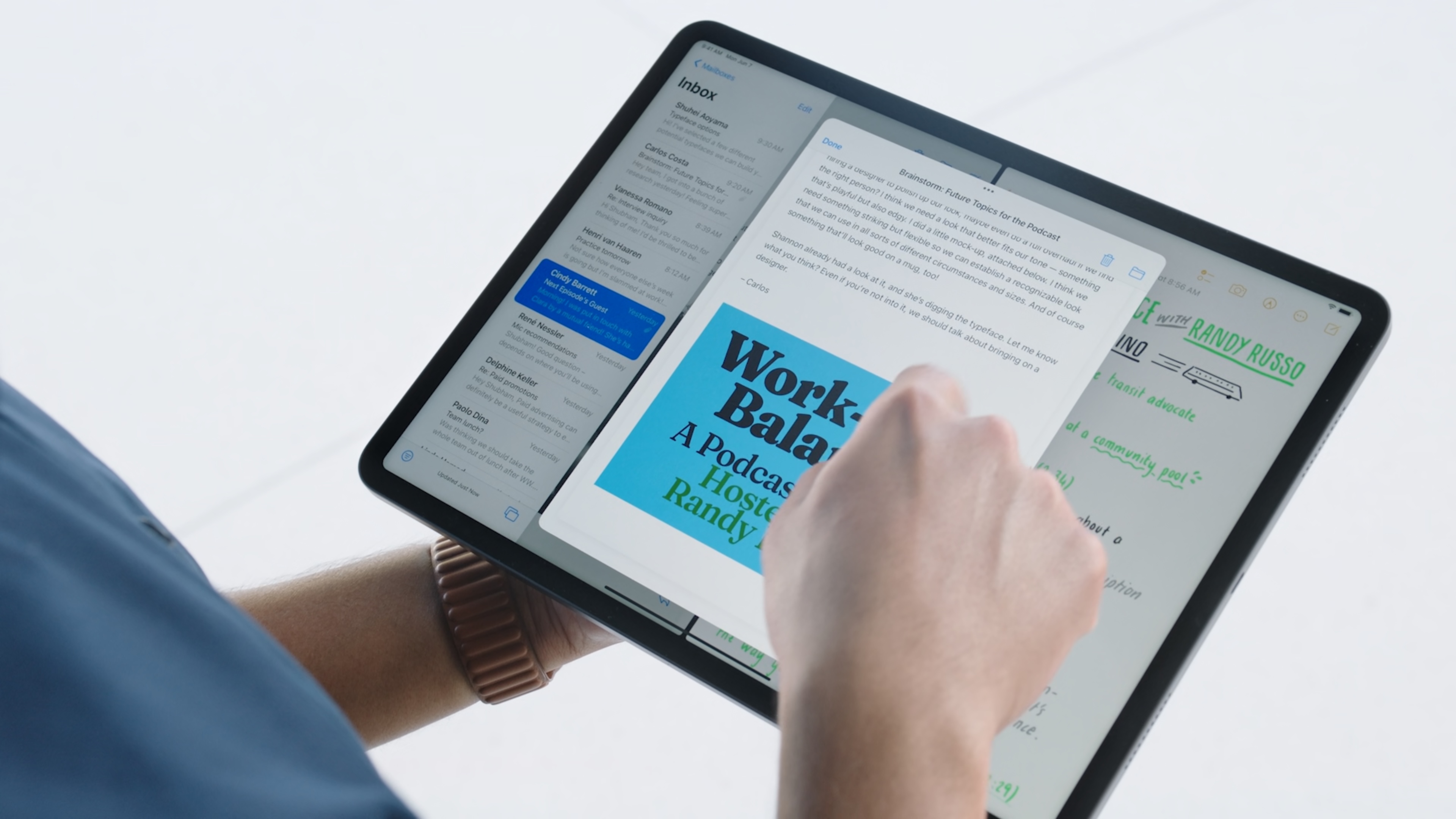
To me, one of the more interesting and potentially powerful developments is the introduction of the Center Window and its accompanying API. A handful of Apple apps like Mail, Notes and Messages now allow items to pop out into an overlapping window.
“It was a very deliberate decision on our part,” says Marineau-Mes about adding this new element. “This really brings a new level of productivity where you can have, you know, this floating window. You can have content behind it. You can seamlessly cut and paste. And that’s something that’s just not possible with the traditional [iPadOS] model. And we also really strive to make it consistent with the rest of multitasking where that center window can also become one of the windows in your split view, or full size, and then go back to to being a center window. We think it’s a cool addition to the model and we look really look forward to 3rd parties embracing it.”
Early reception of the loop Apple gave at iPadOS 15 has an element of reservation about it still given that many of the most powerful creative apps are made by third parties that must adopt these technologies in order for them to be truly useful. But Apple, Borchers says, is working hard to make sure that pro apps adopt as many of these new paradigms and technologies as possible, so that come fall, the iPad will feel like a more hospitable host for the kinds of advanced work pros want to do there.
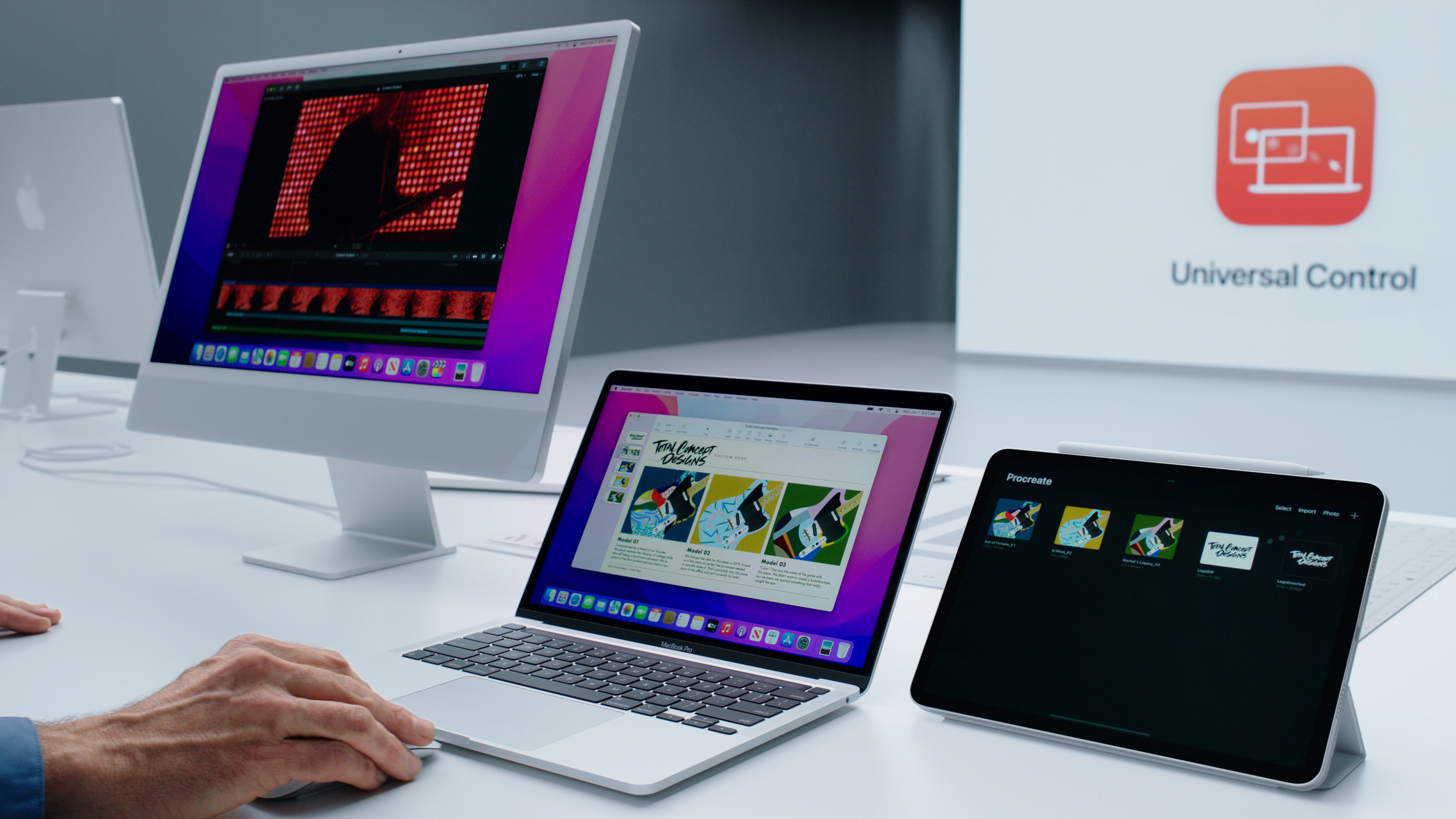
One of the nods to this multi-modal universe that the iPad exists in is Universal Control. This new feature uses Bluetooth beaconing, peer-to-peer WiFi and the iPad’s touchpad support to allow you to place your devices close to one another and — in a clever use of reading user intent — slide your mouse to the edge of a screen and onto your Mac or iPad seamlessly.

CUPERTINO, CALIFORNIA – June 7, 2021: Apple’s senior vice president of Software Engineering Craig Federighi showcases the ease of Universal Control, as seen in this still image from the keynote video of AppleÕs Worldwide Developers Conference at Apple Park. (Photo Credit: Apple Inc.)Ê
“I think what we have seen and observed from our users, both pro and and otherwise, is that we have lots of people who have Macs and they have iPads, and they have other iPhones and and we believe in making these things work together in ways that are that are powerful,” says Borchers. “And it just felt like a natural place to be able to go and extend our Continuity model so that you could make use of this incredible platform that is iPadOS while working with your Mac, right next to it. And I think the big challenge was, how do you do that in kind of a magical, simple way. And that’s what Seb and his team and been able to accomplish.
“It really builds on the foundation we made with Continuity and Sidecar,” adds Marineau-Mes. “We really thought a lot about how do you make the experience — the set up experience — as seamless as possible. How do you discover that you’ve got devices side by side.?
The other thing we thought about was what are the workflows that people want to have and what capabilities that will be essential for that. That’s where thinks like the ability to seamlessly drag content across the platforms or cut and paste was we felt to be really, really important. Because I think that’s really what brings to the magic to the experience.”
Borchers adds that it makes all the continuity features that much more discoverable. Continuity’s shared clipboard, for instance, is an always on but invisible presence. Expanding that to visual and mouse-driven models made some natural sense.
“It’s just like, oh, of course, I can drag that all the way across all the way across here,” he says.
“Bob, you say, of course,” Marineau-Mes laughs. “And yet for those of us working in platforms for a long time, the ‘of course’, is technically very, very challenging. Totally non obvious.”
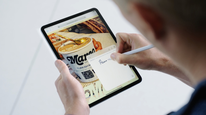
Another area where iPadOS 15 is showing some promising expansionary behavior is in system-wide activities that allow you to break out of the box of in-app thinking. These include embedded recommendations that seed themselves into various apps, Shareplay, which makes an appearance wherever video calls are found and Live Text, which turns all of your photos into indexed archives searchable with a keyboard.
Another is Quick Note, a system extension that lets you swipe from the bottom corner of your screen wherever you are in the system.
“There are, I think a few interesting things that we did with with Quick Note,” says Marineau-Mes. “One is this idea of linking. So, that if I’m working in Safari or Yelp or another app, I can quickly insert a link to whatever content I’m viewing. I don’t know about you, but it’s something that I certainly do a lot when I do research.
“The old way was, like, cut and paste and maybe take a screenshot, create a note and jot down some notes. And now we’ve made that very, very seamless and fluid across the whole system. It even works the other way where, if I’m now in Safari and I have a note that refers to that page in Safari, you’ll see it revealed as a thumbnail at the bottom of the screen’s right hand side. So, we’ve really tried to bring the notes experience to be something that just permeates the system and is easily accessible from, from everywhere.”
Many of the system-wide capabilities that Apple is introducing in iPadOS 15 and iOS 15 have an API that developers can tap into. That is not always the case with Apple’s newest toys, which in years past have often been left to linger in the private section of its list of frameworks rather than be offered to developers as a way to enhance their apps. Borchers says that this is an intentional move that offers a ‘broader foundation of intelligence’ across the entire system.
This broader intelligence includes Siri moving a ton of commands to its local scope. This involved having to move a big chunk of Apple’s speech recognition to an on-device configuration in the new OS as well. The results, says Borchers, are a vastly improved day-to-day Siri experience, with many common commands executing immediately upon request — something that was a bit of a dice roll in days of Siri past. The removal of the reputational hit that Siri was taking from commands that went up to the cloud never to return could be the beginning of a turnaround for the public perception of Siri’s usefulness.
The on-device weaving of the intelligence provided by the Apple Neural Engine (ANE) also includes the indexing of text across photos in the entire system, past, present and in-the-moment.
“We could have done live text only in camera and photos, but we wanted it to apply to anywhere we’ve got images, whether it be in in Safari or quick look or wherever,” says Marineau-Mes. “One of my favorite demos of live text is actually when you’ve got that long complicated field for a password for a Wi-Fi network. You can just actually bring it up within the keyboard and take a picture of it, get the text in it and copy and paste it into into the field. It’s one of those things that’s just kind of magical.”
On the developer service front of iPadOS 15, I ask specifically about Swift Playgrounds, which add the ability to write, compile and ship apps on the App Store for the first time completely on iPad. It’s not the native Xcode some developers were hoping for, but, Borchers says, Playgrounds has moved beyond just ‘teaching people how to code’ and into a real part of many developer pipelines.
“ think one of the big insights here was that we also saw a number of kind of pro developers using it as a prototyping platform, and a way to be able to be on the bus, or in the park, or wherever if you wanted to get in and give something a try, this was super accessible and easy way to get there and could be a nice adjunct to hey, I want to learn to code.”
“If you’re a developer,” adds Marineau-Mes, “it’s actually more productive to be able to run that app on the device that you’re working on because you really get great fidelity. And with the open project format, you can go back and forth between Xcode and Playgrounds. So, as Bob said, we can really envision people using this for a lot of rapid prototyping on the go without having to bring along the rest of their development environment so we think it’s a really, really powerful addition to our development development tools this year.”
Way back in 2018 I profiled a new team at Apple that was building out a testing apparatus that would help them to make sure they were addressing real-world use cases for flows of process that included machines like the (at the time un-revealed) new Mac Pro, iMacs, MacBooks and iPads. One of the demos that stood out at the time was a deep integration with music apps like Logic that would allow the input models of iPad to complement the core app. Tapping out a rhythm on a pad, brightening or adjusting sound more intuitively with the touch interface. More of Apple’s work these days seems to be aimed at allowing users to move seamlessly back and forth between its various computing platforms, taking advantage of the strengths of each (raw power, portability, touch, etc) to complement a workflow. A lot of iPadOS 15 appears to be geared this way.
Whether it will be enough to turn the corner on the perception of iPad as a work device that is being held back by software, I’ll reserve judgement until it ships later this year. But, in the near term, I am cautiously optimistic that this set of enhancements that break out of the ‘app box’, the clearer affordances for multitasking both in and out of single apps and the dedication to API support are pointing towards an expansionist mentality on the iPad software team. A good sign in general.


